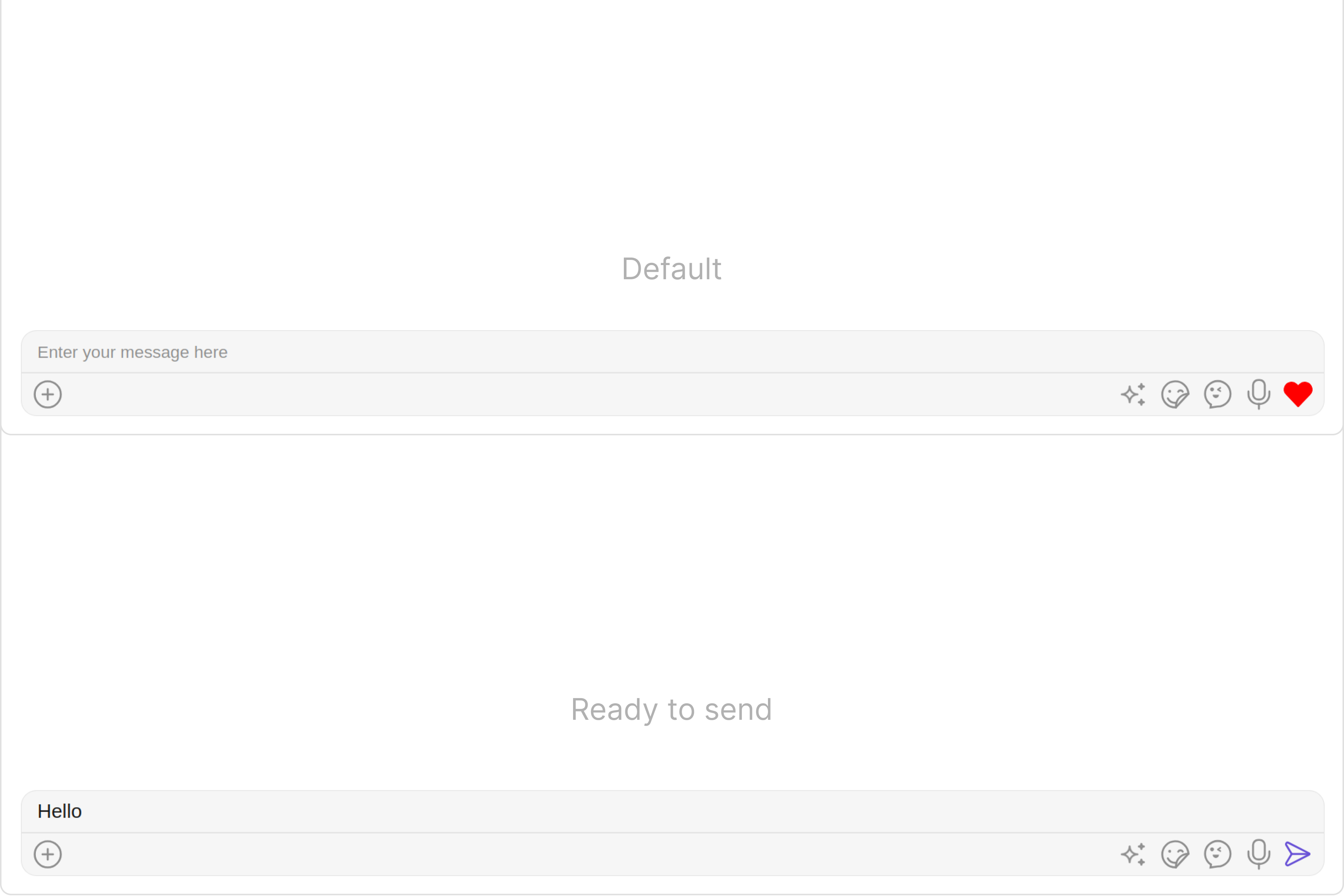
MessageComposer is a Component that enables users to write and send a variety of messages, including text, image, video, and custom messages.Features such as Live Reaction, Attachments, and Message Editing are also supported by it.
MessageComposer is comprised of the following Base Components:
Actions dictate how a component functions. They are divided into two types: Predefined and User-defined. You can override either type, allowing you to tailor the behavior of the component to fit your specific needs.
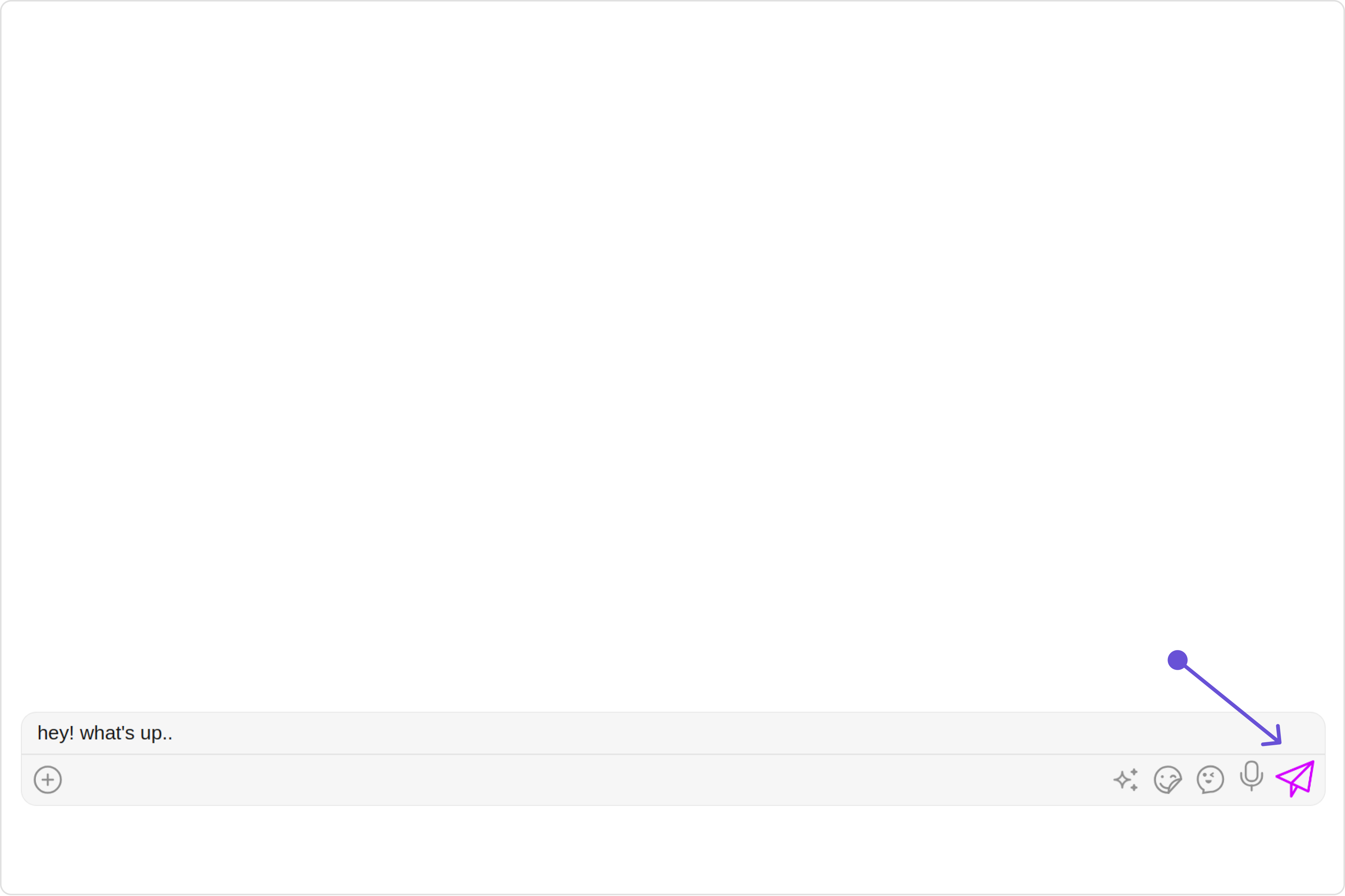
1. OnSendButtonClick
The OnSendButtonClick event gets activated when the send message button is clicked. It has a predefined function of sending messages entered in the composer EditText. However, you can overide this action with the following code snippet.
Events are emitted by a Component. By using event you can extend existing functionality. Being global events, they can be applied in Multiple Locations and are capable of being Added or Removed.The list of events emitted by the Messages component is as follows.
Event
Description
ccMessageEdited
Triggers whenever a loggedIn user edits any message from the list of messages .it will have three states such as: inProgress, success and error
ccMessageSent
Triggers whenever a loggedIn user sends any message, it will have three states such as: inProgress, success and error
ccLiveReaction
Triggers whenever a loggedIn clicks on live reaction
Adding CometChatMessageEvents Listener’s
TypeScript
import {CometChatMessageEvents} from "@cometchat/chat-uikit-angular";this.ccMessageEdited = CometChatMessageEvents.ccMessageEdited.subscribe( () => { // Your Code } );this.ccMessageSent = CometChatMessageEvents.ccMessageSent.subscribe( () => { // Your Code } );this.ccLiveReaction = CometChatMessageEvents.ccLiveReaction.subscribe( () => { // Your Code } );
To fit your app’s design requirements, you can customize the appearance of the MessageComposer component. We provide exposed methods that allow you to modify the experience and behavior according to your specific needs.
Using Style you can customize the look and feel of the component in your app, These parameters typically control elements such as the color, size, shape, and fonts used within the component.
1. MessageComposer Style
To modify the styling, you can apply the MessageComposerStyle to the MessageComposer Component using the messageComposerStyle property.
The following properties are exposed by MessageComposerStyle:
Property
Description
Code
border
Used to set border
border?: string,
borderRadius
Used to set border radius
borderRadius?: string;
background
Used to set background colour
background?: string;
height
Used to set height
height?: string;
width
Used to set width
width?: string;
inputBackground
Used to set input background color
inputBackground?: string;
inputBorder
used to set input border
inputBorder?: string;
inputBorderRadius
used to set input border radius
inputBorderRadius?: string;
textFont
Used to set input text font
textFont?: string;
textColor
used to set input text color
textColor?: string;
placeHolderTextColor
Used to set placeholder text color
placeHolderTextColor?: string;
placeHolderTextFont
Used to set placeholder text font
placeHolderTextFont?: string;
attachIcontint
Used to set attachment icon tint
attachIcontint?: string;
sendIconTint
Used to set send button icon tint
sendIconTint?: string;
dividerTint
Used to set separator color
dividerTint?: string;
voiceRecordingIconTint
used to set voice recording icon color
voiceRecordingIconTint?: string;
emojiIconTint
used to set emoji icon color
emojiIconTint?: string;
AIIconTint
used to set AI icon color
AIIconTint?: string;
emojiKeyboardTextFont
used to set emoji keyboard text font
emojiKeyboardTextFont?: string;
previewTitleFont
used to set preview title font
previewTitleFont?: string;
previewTitleColor
used to set preview title color
previewTitleColor?: string;
previewSubtitleFont
used to set preview subtitle font
previewSubtitleFont?: string;
previewSubtitleColor
used to set preview subtitle color
previewSubtitleColor?: string;
closePreviewTint
used to set close preview color
closePreviewTint?: string;
maxInputHeight
used to set max input height
maxInputHeight?: string;
2. MediaRecorder Style
To customize the styles of the MediaRecorder component within the MessageComposer Component, use the mediaRecorderStyle property. For more details, please refer to MediaRecorder styles.
These are a set of small functional customizations that allow you to fine-tune the overall experience of the component. With these, you can change text, set custom icons, and toggle the visibility of UI elements.
used to toggle visibility for live reaction component
[hideLiveReaction]="true"
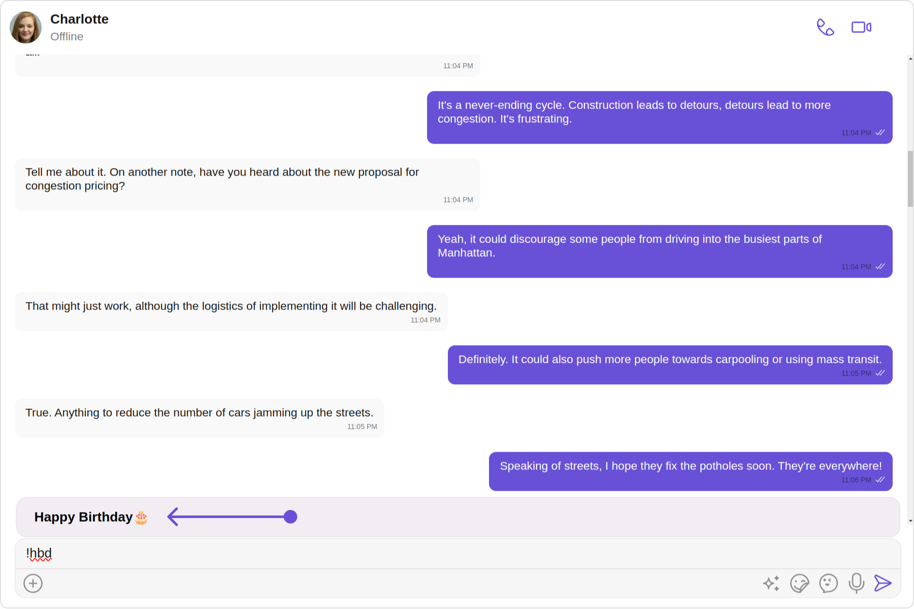
customSoundForMessage
Used to give custom sounds to outgoing messages
customSoundForMessage="your custom sound for messages"
LiveReactionIconURL
used to set custom live reaction icon.
LiveReactionIconURL="your custom live reaction icon"
AIIconURL
used to set custom AI icon.
AIIconURL="your custom AI icon"
emojiIconURL
used to set custom emoji icon.
emojiIconURL="your custom emoji icon"
hideLayoutMode
used to hide the layout mode.
[hideLayoutMode]="true"
hideVoiceRecording
used to hide the voice recording option.
[hideVoiceRecording]="true"
Disable Mentions
Sets whether mentions in text should be disabled. Processes the text formatters If there are text formatters available and the disableMentions flag is set to true, it removes any formatters that are instances of CometChatMentionsFormatter.
For advanced-level customization, you can set custom views to the component. This lets you tailor each aspect of the component to fit your exact needs and application aesthetics. You can create and define your views, layouts, and UI elements and then incorporate those into the component.
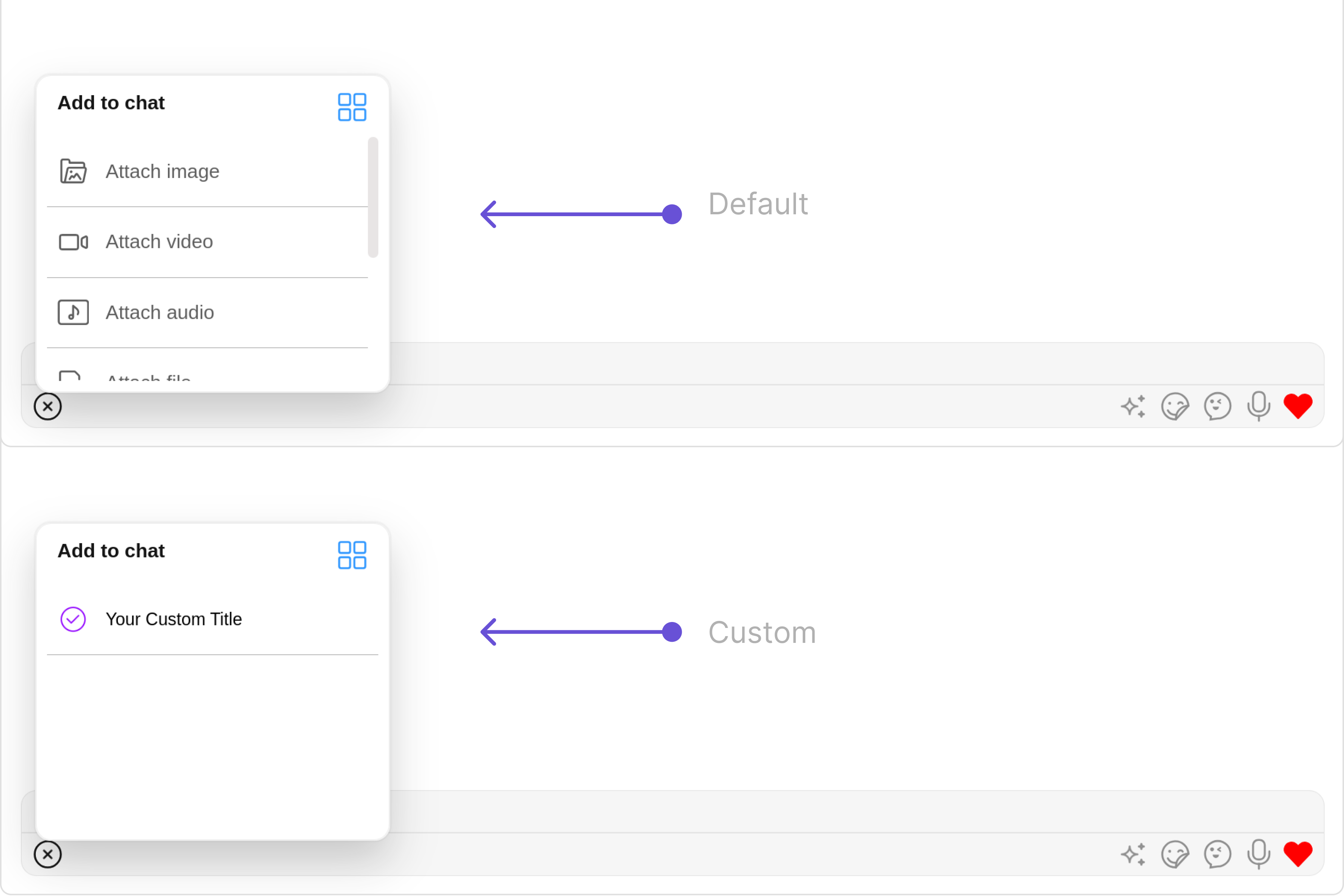
By using attachmentOptions, you can set a list of custom MessageComposerActions for the MessageComposer Component. This will override the existing list of MessageComposerActions.Example
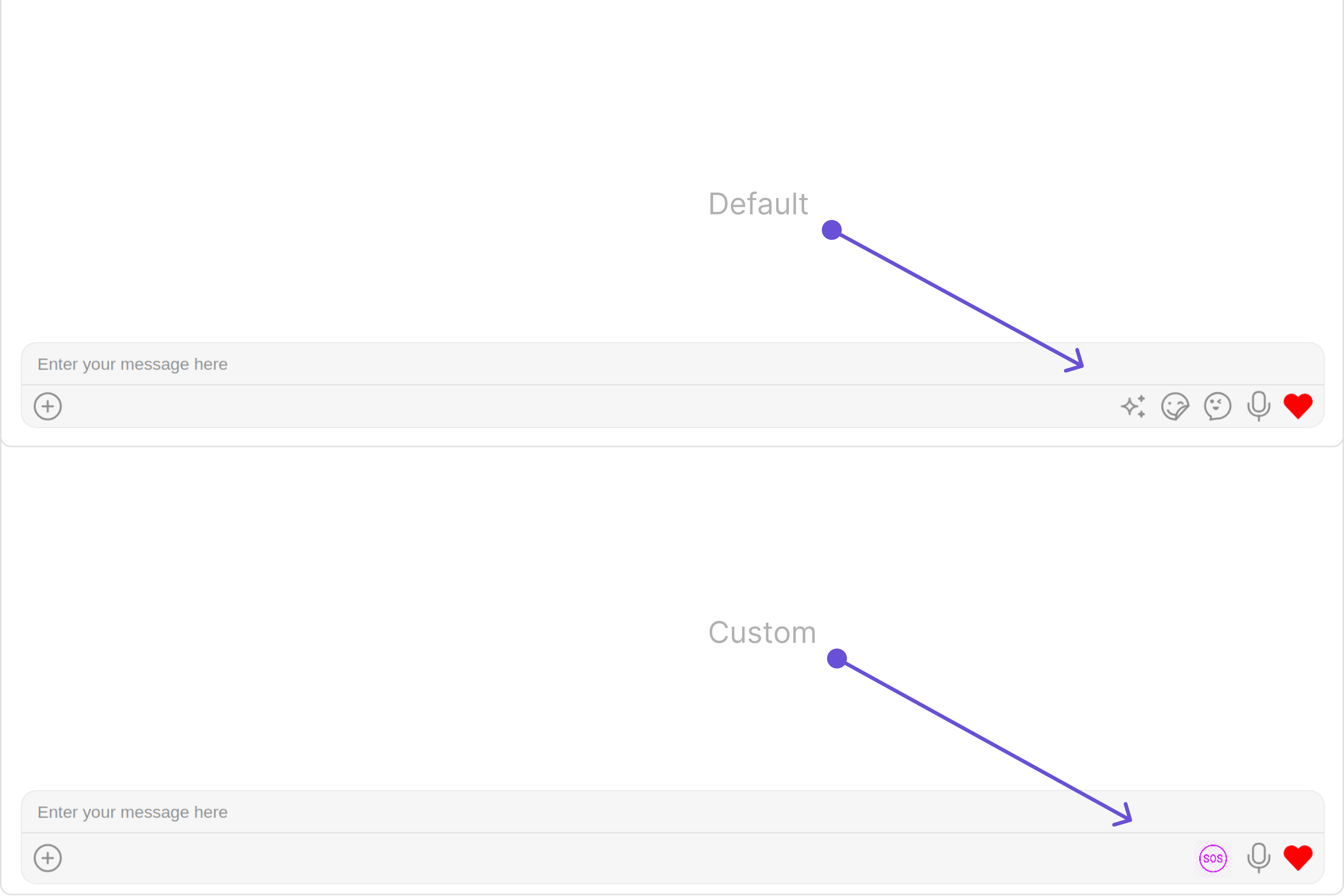
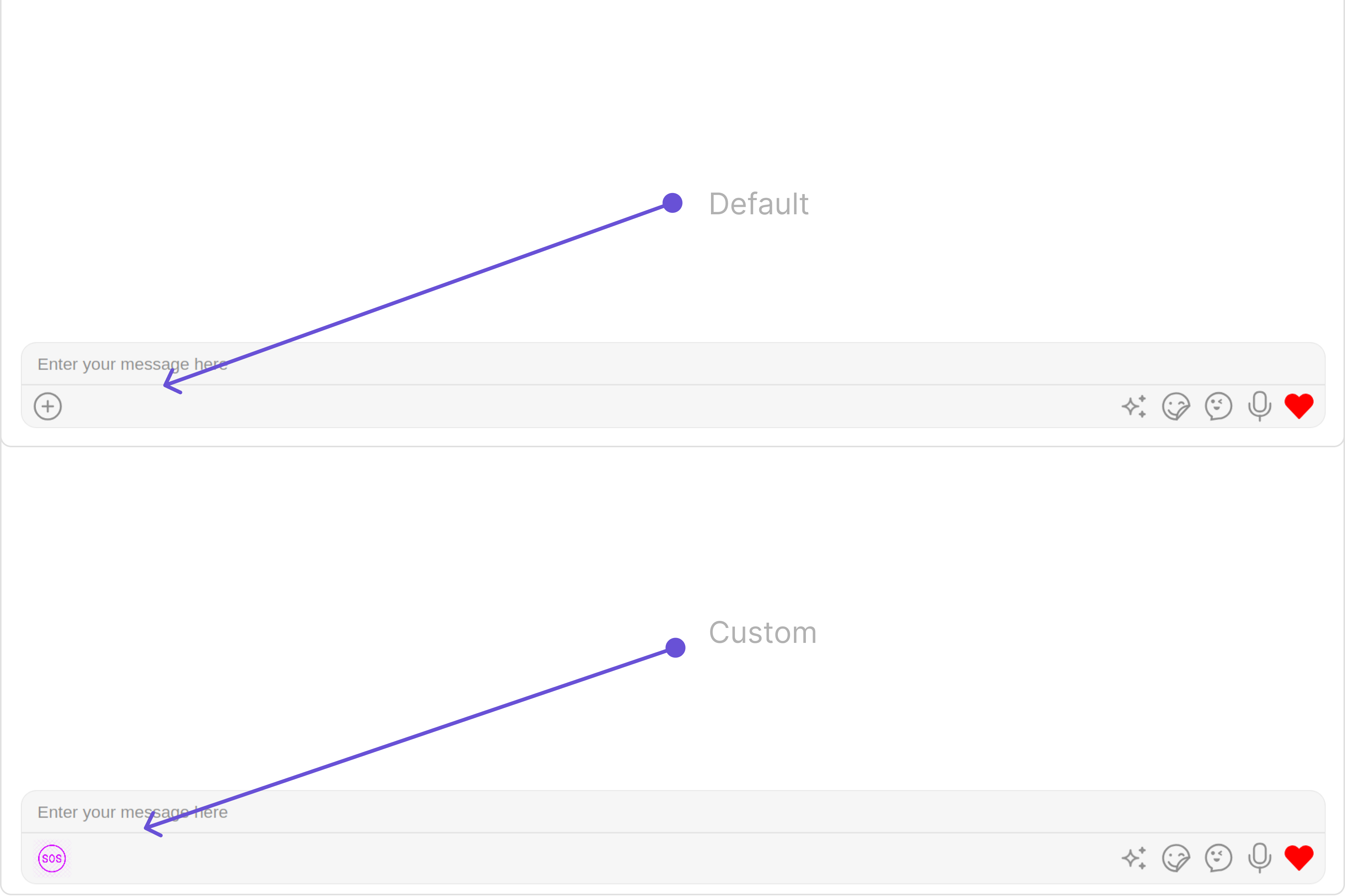
You can insert a custom view into the MessageComposer component to add additional functionality using the following method.Please note that the MessageComposer Component utilizes the AuxiliaryButton to provide sticker functionality. Overriding the AuxiliaryButton will subsequently replace the sticker functionality.In this example, we’ll be adding a custom SOS button.Example
You can add a custom view into the SecondaryButton component for additional functionality using the below method.In this example, we’ll be adding a custom SOS button.Example
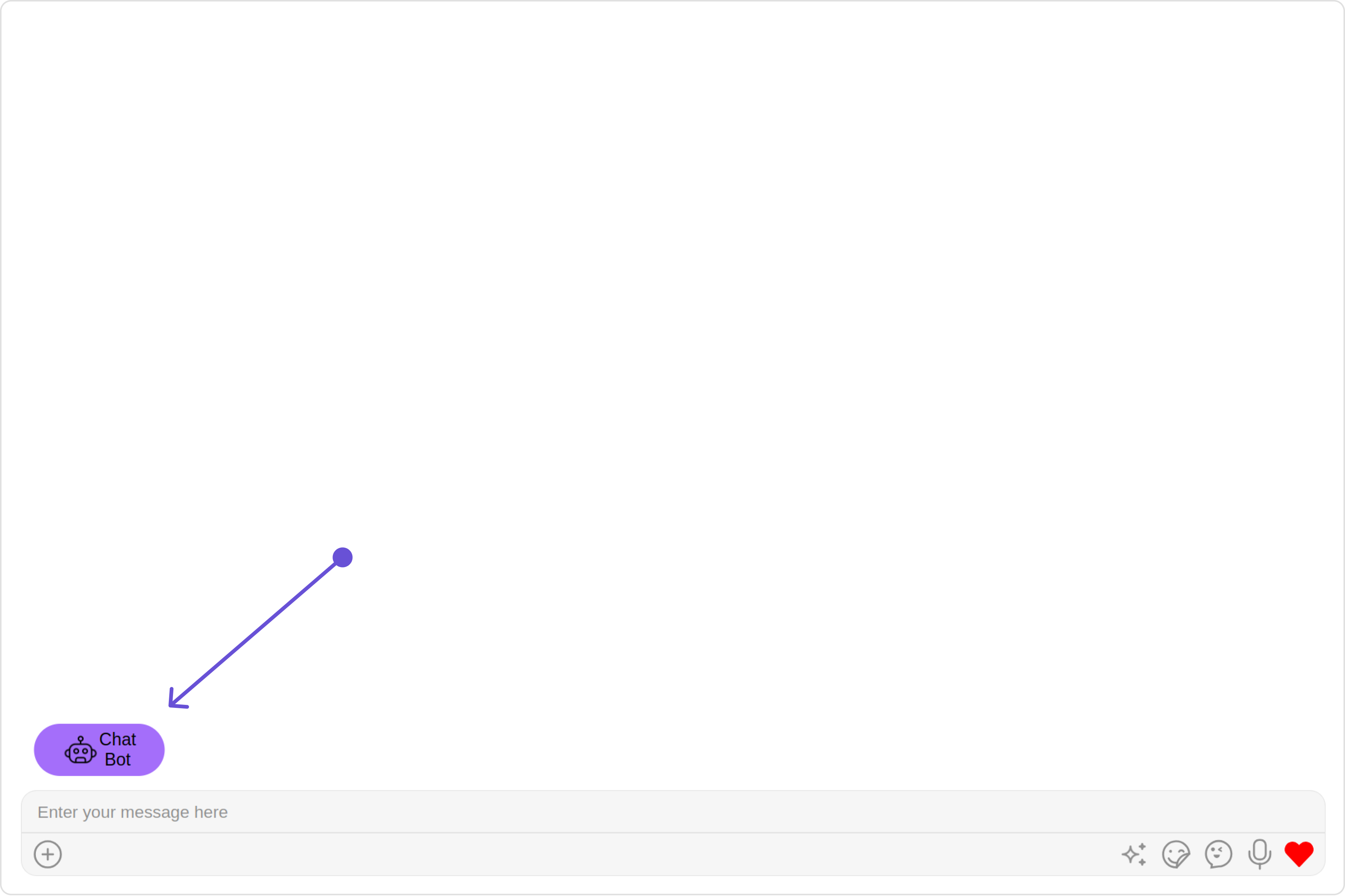
You can set custom headerView to the MessageComposer component using the following methodIn the following example, we’re going to apply a mock chat bot button to the MessageComposer Component using the headerView property.Example
Assigns the list of text formatters. If the provided list is not null, it sets the list. Otherwise, it assigns the default text formatters retrieved from the data source. To configure the existing Mentions look and feel check out CometChatMentionsFormatter.Example
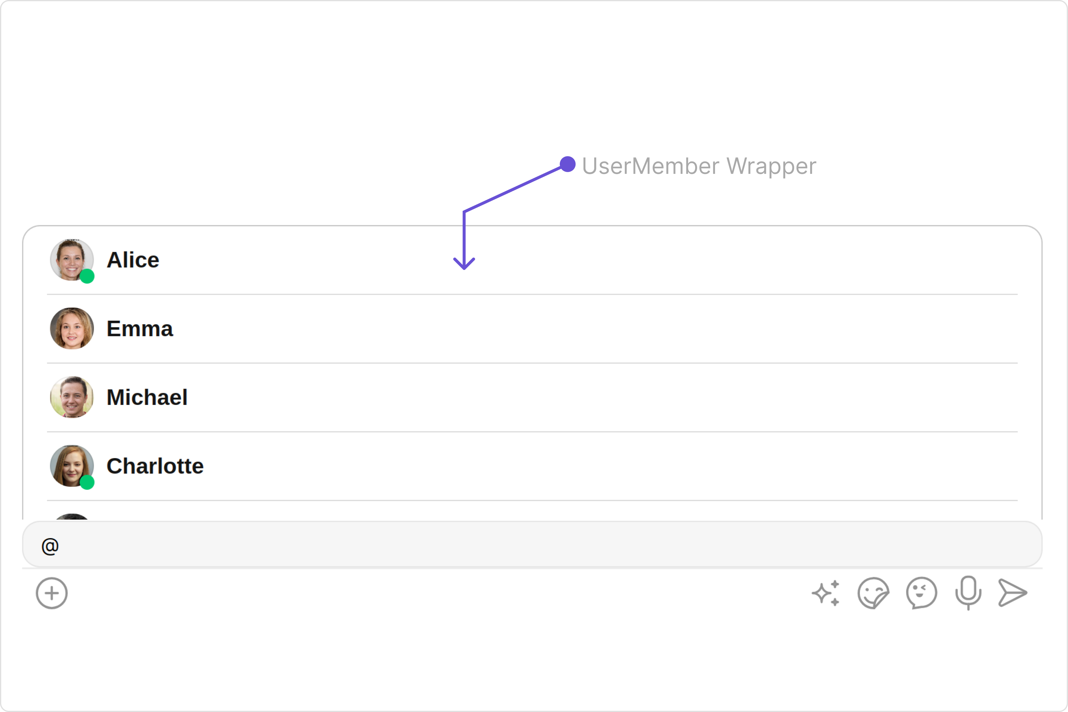
The UserMemberWrapperConfiguration indeed provides access to all the Action, Filters, Styles, Functionality, and Advanced properties of the UserMemberWrapper component.Please note that the Properties marked with the 🛑 symbol are not accessible within the Configuration Object.Example
In the above example, we are styling a few properties of the UserMemberWrapper component using UserMemberWrapperConfiguration.