Documentation Index Fetch the complete documentation index at: https://www.cometchat.com/docs/llms.txt
Use this file to discover all available pages before exploring further.
AI Integration Quick Reference
Field Value Package @cometchat/chat-uikit-reactFramework Astro (with @astrojs/react islands) Components CometChatConversations, CometChatCallLogs, CometChatUsers, CometChatGroups, CometChatMessageHeader, CometChatMessageList, CometChatMessageComposerLayout Tabbed sidebar (Chats, Calls, Users, Groups) + message view Prerequisite Complete Astro Integration Steps 1–5 first SSR client:only="react" directive — CometChat requires browser APIsPattern Full-featured messaging app with multiple sections
This guide builds a tabbed messaging UI — Chats, Calls, Users, and Groups tabs in the sidebar, with a message view on the right. Good for full-featured apps that need more than just conversations.
This assumes you’ve already completed Astro Integration (project created, React added, UI Kit installed).
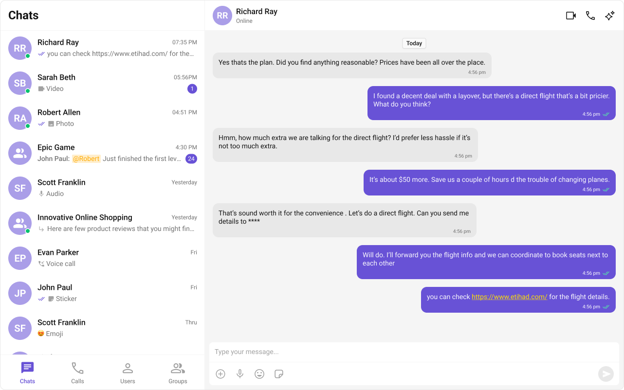
What You’re Building
Three sections working together:
Tab bar — switches between Chats, Calls, Users, and Groups
Sidebar — renders the list for the active tab
Message view — header + messages + composer for the selected item
Step 1 — Create the Tab Component
Tab icons need to be placed in public/assets/. Download them from the CometChat UI Kit assets folder on GitHub .
import { useState } from "react" ;
import "./CometChatTabs.css" ;
const chatsIcon = "/assets/chats.svg" ;
const callsIcon = "/assets/calls.svg" ;
const usersIcon = "/assets/users.svg" ;
const groupsIcon = "/assets/groups.svg" ;
export const CometChatTabs = ( props : {
onTabClicked ?: ( tabItem : { name : string ; icon ?: string }) => void ;
activeTab ?: string ;
}) => {
const { onTabClicked = () => {}, activeTab } = props ;
const [ hoverTab , setHoverTab ] = useState ( "" );
const tabItems = [
{ name: "CHATS" , icon: chatsIcon },
{ name: "CALLS" , icon: callsIcon },
{ name: "USERS" , icon: usersIcon },
{ name: "GROUPS" , icon: groupsIcon },
];
return (
< div className = "cometchat-tab-component" >
{ tabItems . map (( tabItem ) => {
const isActive =
activeTab === tabItem . name . toLowerCase () ||
hoverTab === tabItem . name . toLowerCase ();
return (
< div
key = { tabItem . name }
className = "cometchat-tab-component__tab"
onClick = { () => onTabClicked ( tabItem ) }
>
< div
className = {
isActive
? "cometchat-tab-component__tab-icon cometchat-tab-component__tab-icon-active"
: "cometchat-tab-component__tab-icon"
}
style = { {
WebkitMaskImage: `url( ${ tabItem . icon } )` ,
maskImage: `url( ${ tabItem . icon } )` ,
} }
onMouseEnter = { () => setHoverTab ( tabItem . name . toLowerCase ()) }
onMouseLeave = { () => setHoverTab ( "" ) }
/>
< div
className = {
isActive
? "cometchat-tab-component__tab-text cometchat-tab-component__tab-text-active"
: "cometchat-tab-component__tab-text"
}
onMouseEnter = { () => setHoverTab ( tabItem . name . toLowerCase ()) }
onMouseLeave = { () => setHoverTab ( "" ) }
>
{ tabItem . name }
</ div >
</ div >
);
}) }
</ div >
);
};
.cometchat-tab-component {
display : flex ;
width : 100 % ;
padding : 0 px 8 px ;
align-items : flex-start ;
gap : 8 px ;
border-top : 1 px solid var ( --cometchat-border-color-light , #F5F5F5 );
border-right : 1 px solid var ( --cometchat-border-color-light , #F5F5F5 );
background : var ( --cometchat-background-color-01 , #FFF );
}
.cometchat-tab-component__tab {
display : flex ;
padding : 12 px 0 px 10 px 0 px ;
flex-direction : column ;
justify-content : center ;
align-items : center ;
gap : 4 px ;
flex : 1 0 0 ;
min-height : 48 px ;
}
.cometchat-tab-component__tab-icon {
display : flex ;
width : 32 px ;
height : 32 px ;
justify-content : center ;
align-items : center ;
background : var ( --cometchat-icon-color-secondary );
-webkit-mask-size : contain ;
-webkit-mask-position : center ;
-webkit-mask-repeat : no-repeat ;
mask-size : contain ;
mask-position : center ;
mask-repeat : no-repeat ;
cursor : pointer ;
}
.cometchat-tab-component__tab-text {
color : var ( --cometchat-text-color-secondary , #727272 );
text-align : center ;
font : var ( --cometchat-font-caption1-medium , 500 12 px Roboto);
cursor : pointer ;
}
.cometchat-tab-component__tab-icon-active {
background : var ( --cometchat-icon-color-highlight );
}
.cometchat-tab-component__tab-text-active {
color : var ( --cometchat-text-color-highlight );
}
The sidebar renders the list for whichever tab is active, plus the tab bar at the bottom.
import { useEffect , useState } from "react" ;
import { Call , Conversation , Group , User , CometChat } from "@cometchat/chat-sdk-javascript" ;
import { CometChatCallLogs , CometChatConversations , CometChatGroups , CometChatUIKitLoginListener , CometChatUsers } from "@cometchat/chat-uikit-react" ;
import { CometChatTabs } from "../CometChatTabs/CometChatTabs" ;
interface SelectorProps {
onSelectorItemClicked ?: ( input : User | Group | Conversation | Call , type : string ) => void ;
}
export const CometChatSelector = ( props : SelectorProps ) => {
const { onSelectorItemClicked = () => {} } = props ;
const [ loggedInUser , setLoggedInUser ] = useState < CometChat . User | null >();
const [ activeItem , setActiveItem ] = useState < Conversation | User | Group | Call | undefined >();
const [ activeTab , setActiveTab ] = useState < string >( "chats" );
useEffect (() => {
const user = CometChatUIKitLoginListener . getLoggedInUser ();
setLoggedInUser ( user );
}, []);
return (
<>
{ loggedInUser && (
<>
{ activeTab === "chats" && (
< CometChatConversations
activeConversation = { activeItem instanceof CometChat . Conversation ? activeItem : undefined }
onItemClick = { ( item ) => { setActiveItem ( item ); onSelectorItemClicked ( item , "updateSelectedItem" ); } }
/>
) }
{ activeTab === "calls" && (
< CometChatCallLogs
activeCall = { activeItem as Call }
onItemClick = { ( item : Call ) => { setActiveItem ( item ); onSelectorItemClicked ( item , "updateSelectedItemCall" ); } }
/>
) }
{ activeTab === "users" && (
< CometChatUsers
activeUser = { activeItem as User }
onItemClick = { ( item ) => { setActiveItem ( item ); onSelectorItemClicked ( item , "updateSelectedItemUser" ); } }
/>
) }
{ activeTab === "groups" && (
< CometChatGroups
activeGroup = { activeItem as Group }
onItemClick = { ( item ) => { setActiveItem ( item ); onSelectorItemClicked ( item , "updateSelectedItemGroup" ); } }
/>
) }
</>
) }
< CometChatTabs activeTab = { activeTab } onTabClicked = { ( item ) => setActiveTab ( item . name . toLowerCase ()) } />
</>
);
};
.selector-wrapper .cometchat-conversations .cometchat-list__header-menu .cometchat-button__icon {
background : var ( --cometchat-icon-color-primary );
}
.cometchat-conversations .cometchat-list__header-menu .cometchat-button__icon:hover {
background : var ( --cometchat-icon-color-highlight );
}
.cometchat-list__header-search-bar { border-right : none ; }
.cometchat .cometchat-menu-list__sub-menu-list-item { text-align : left ; }
.cometchat .cometchat-conversations .cometchat-menu-list__sub-menu-list {
width : 212 px ; top : 40 px !important ; left : 172 px !important ;
}
#logged-in-user { border-bottom : 2 px solid var ( --cometchat-border-color-default , #E8E8E8 ); }
#logged-in-user .cometchat-menu-list__sub-menu-item-title ,
#logged-in-user .cometchat-menu-list__sub-menu-list-item { cursor : default ; }
.cometchat-menu-list__sub-menu-list-item-icon-log-out { background-color : var ( --cometchat-error-color , #F44649 ); }
.cometchat-menu-list__sub-menu-item-title-log-out { color : var ( --cometchat-error-color , #F44649 ); }
.chat-menu .cometchat .cometchat-menu-list__sub-menu-item-title { cursor : pointer ; }
.chat-menu .cometchat .cometchat-menu-list__sub-menu { box-shadow : none ; }
.chat-menu .cometchat .cometchat-menu-list__sub-menu-icon {
background-color : var ( --cometchat-icon-color-primary , #141414 ); width : 24 px ; height : 24 px ;
}
Key points:
The activeTab state drives which list component renders — CometChatConversations, CometChatCallLogs, CometChatUsers, or CometChatGroups.
Each list component passes its selection back to the parent via onSelectorItemClicked.
CometChatTabs renders at the bottom of the sidebar.
Step 3 — Create the TabbedChat Island
This component handles init, login, and renders the full tabbed chat experience. It runs client-side only via client:only="react".
import { useEffect , useState } from "react" ;
import {
CometChatMessageComposer ,
CometChatMessageHeader ,
CometChatMessageList ,
CometChatUIKit ,
UIKitSettingsBuilder ,
} from "@cometchat/chat-uikit-react" ;
import { CometChat } from "@cometchat/chat-sdk-javascript" ;
import { CometChatSelector } from "./CometChatSelector/CometChatSelector" ;
import "@cometchat/chat-uikit-react/css-variables.css" ;
import "./TabbedChat.css" ;
const COMETCHAT_CONSTANTS = {
APP_ID: "" , // Replace with your App ID
REGION: "" , // Replace with your Region
AUTH_KEY: "" , // Replace with your Auth Key (dev only)
};
const UID = "cometchat-uid-4" ; // Replace with your actual UID
export default function TabbedChat () {
const [ user , setUser ] = useState < CometChat . User | undefined >( undefined );
const [ selectedUser , setSelectedUser ] = useState < CometChat . User | undefined >( undefined );
const [ selectedGroup , setSelectedGroup ] = useState < CometChat . Group | undefined >( undefined );
useEffect (() => {
const UIKitSettings = new UIKitSettingsBuilder ()
. setAppId ( COMETCHAT_CONSTANTS . APP_ID )
. setRegion ( COMETCHAT_CONSTANTS . REGION )
. setAuthKey ( COMETCHAT_CONSTANTS . AUTH_KEY )
. subscribePresenceForAllUsers ()
. build ();
CometChatUIKit . init ( UIKitSettings )
. then (() => {
console . log ( "Initialization completed successfully" );
CometChatUIKit . getLoggedinUser (). then (( loggedInUser ) => {
if ( ! loggedInUser ) {
CometChatUIKit . login ( UID )
. then (( u ) => {
console . log ( "Login Successful" , { u });
setUser ( u );
})
. catch (( error ) => console . error ( "Login failed" , error ));
} else {
console . log ( "Already logged-in" , { loggedInUser });
setUser ( loggedInUser );
}
});
})
. catch (( error ) => console . error ( "Initialization failed" , error ));
}, []);
if ( ! user ) return < div > Initializing Chat... </ div > ;
return (
< div className = "conversations-with-messages" >
< div className = "conversations-wrapper" >
< CometChatSelector
onSelectorItemClicked = { ( activeItem ) => {
let item : any = activeItem ;
if ( activeItem instanceof CometChat . Conversation ) {
item = activeItem . getConversationWith ();
}
if ( item instanceof CometChat . User ) {
setSelectedUser ( item );
setSelectedGroup ( undefined );
} else if ( item instanceof CometChat . Group ) {
setSelectedUser ( undefined );
setSelectedGroup ( item );
} else {
setSelectedUser ( undefined );
setSelectedGroup ( undefined );
}
} }
/>
</ div >
{ selectedUser || selectedGroup ? (
< div className = "messages-wrapper" >
< CometChatMessageHeader user = { selectedUser } group = { selectedGroup } />
< CometChatMessageList user = { selectedUser } group = { selectedGroup } />
< CometChatMessageComposer user = { selectedUser } group = { selectedGroup } />
</ div >
) : (
< div className = "empty-conversation" > Select a conversation to start chatting </ div >
) }
</ div >
);
}
.conversations-with-messages {
display : flex ;
height : 100 % ;
width : 100 % ;
}
.conversations-wrapper {
height : 100 % ;
width : 480 px ;
overflow : hidden ;
display : flex ;
flex-direction : column ;
}
.conversations-wrapper > .cometchat { overflow : hidden ; }
.messages-wrapper {
width : calc ( 100 % - 480 px );
height : 100 % ;
display : flex ;
flex-direction : column ;
}
.empty-conversation {
height : 100 % ;
width : 100 % ;
display : flex ;
justify-content : center ;
align-items : center ;
background : var ( --cometchat-background-color-03 , #F5F5F5 );
color : var ( --cometchat-text-color-secondary , #727272 );
font : var ( --cometchat-font-body-regular , 400 14 px Roboto);
}
.cometchat .cometchat-message-composer { border-radius : 0 px ; }
How it works:
Selections from any tab (Chats, Calls, Users, Groups) flow through the same onSelectorItemClicked callback.
Conversation items are unwrapped via getConversationWith() to extract the underlying User or Group.
Only one of selectedUser / selectedGroup is set at a time — the other is cleared.
Step 4 — Render the Astro Page
Import the island and hydrate it client-side using client:only="react".
---
import TabbedChat from "../components/TabbedChat.tsx" ;
import "../styles/globals.css" ;
---
< html lang = "en" >
< head >
< meta charset = "utf-8" />
< title > Tabbed Messaging UI </ title >
</ head >
< body >
< TabbedChat client:only = "react" />
</ body >
</ html >
The client:only="react" directive ensures the component skips SSR entirely and only renders in the browser.
Step 5 — Run the Project
You should see the tab bar at the bottom of the sidebar. Switch between Chats, Calls, Users, and Groups — tapping any item loads the message view on the right.
Next Steps
Theming Customize colors, fonts, and styles to match your brand
Components Overview Browse all prebuilt UI components
Astro Integration Back to the main setup guide
Core Features Chat features included out of the box