AI Integration Quick Reference
AI Integration Quick Reference
| Field | Value |
|---|---|
| Goal | Customize incoming/outgoing message bubble appearance |
| Provider | CometChatThemeProvider — pass bubble styles in theme.messageListStyles |
| Import | import { CometChatThemeProvider } from "@cometchat/chat-uikit-react-native"; |
| Incoming bubbles | messageListStyles: { incomingMessageBubbleStyles: { containerStyle: { backgroundColor: "#FEEDE1" } } } |
| Outgoing bubbles | messageListStyles: { outgoingMessageBubbleStyles: { containerStyle: { backgroundColor: "#F76808" } } } |
| Bubble types | textBubbleStyles, imageBubbleStyles, videoBubbleStyles, audioBubbleStyles, fileBubbleStyles, pollBubbleStyles, stickerBubbleStyles, assistantBubbleStyles |
| Special bubbles | deletedBubbleStyles, collaborativeBubbleStyles, groupCallBubbleStyles, linkPreviewBubbleStyles |
| Action bubbles | groupActionBubbleStyles, callActionBubbleStyles, userCallBubbleStyles |
| Precedence | Specific bubble style > Container style > Default (deep merge) |
| Source | GitHub theme interface |
theme.messageListStyles.
Bubble Style Keys
| Bubble Type | Style Key | Common Properties |
|---|---|---|
| All incoming | incomingMessageBubbleStyles | containerStyle, avatarStyle, receiptStyles, reactionStyles |
| All outgoing | outgoingMessageBubbleStyles | containerStyle, avatarStyle, receiptStyles, reactionStyles |
| Text | textBubbleStyles | containerStyle, textStyle, mentionsStyle |
| AI Assistant | assistantBubbleStyles | containerStyle, textStyle, copyButtonStyle, errorContainerStyle |
| Image | imageBubbleStyles | containerStyle, imageStyle |
| Video | videoBubbleStyles | containerStyle, playIconStyle, playIconContainerStyle |
| Audio | audioBubbleStyles | containerStyle, playIconStyle, waveStyle |
| File | fileBubbleStyles | containerStyle, titleStyle, subtitleStyle, downloadIconStyle |
| Sticker | stickerBubbleStyles | containerStyle, imageStyle |
| Poll | pollBubbleStyles | containerStyle, progressBarStyle, selectedIconStyle, titleStyle |
| Link Preview | linkPreviewBubbleStyles | containerStyle, bodyStyle, headerImageContainerStyle |
| Collaborative | collaborativeBubbleStyles | containerStyle, iconStyle, buttonTextStyle, dividerStyle |
| Meet Call | meetCallBubbleStyles | containerStyle, iconStyle, dividerStyle |
| Deleted | deletedBubbleStyles | containerStyle, icon |
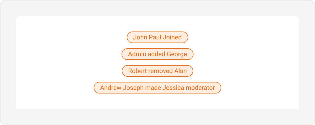
| Group Action | groupActionBubbleStyles | containerStyle, textStyle |
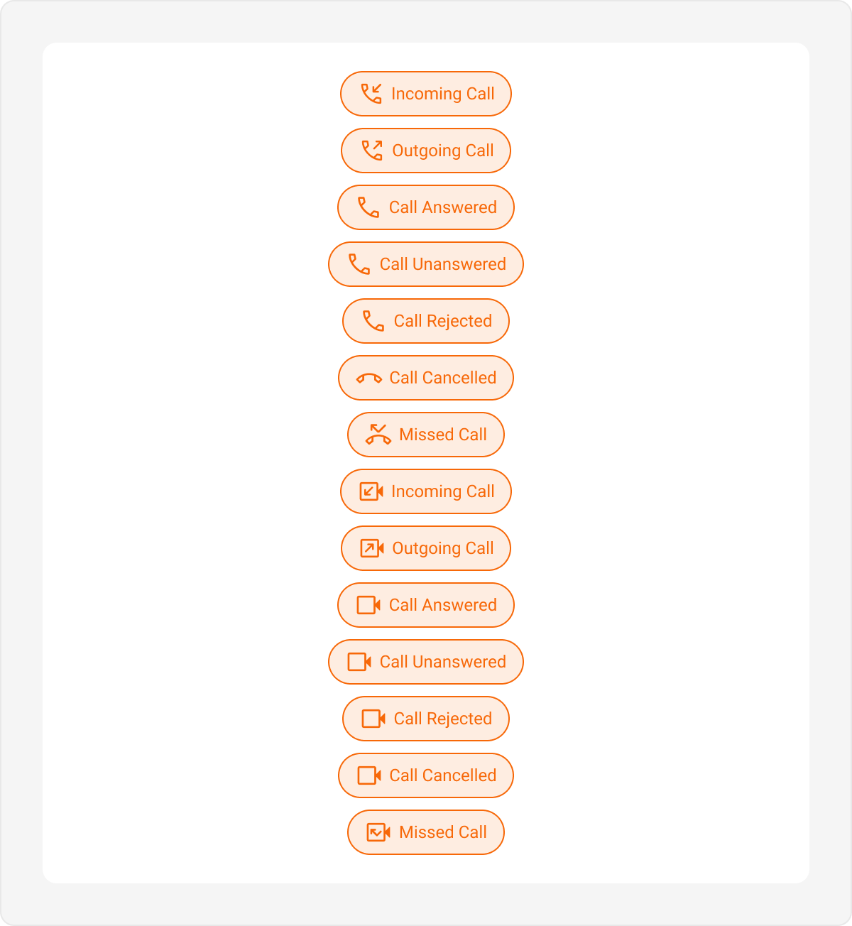
| Call Action | callActionBubbleStyles | containerStyle, textStyle, iconStyle, missedCallContainerStyle |
Overview
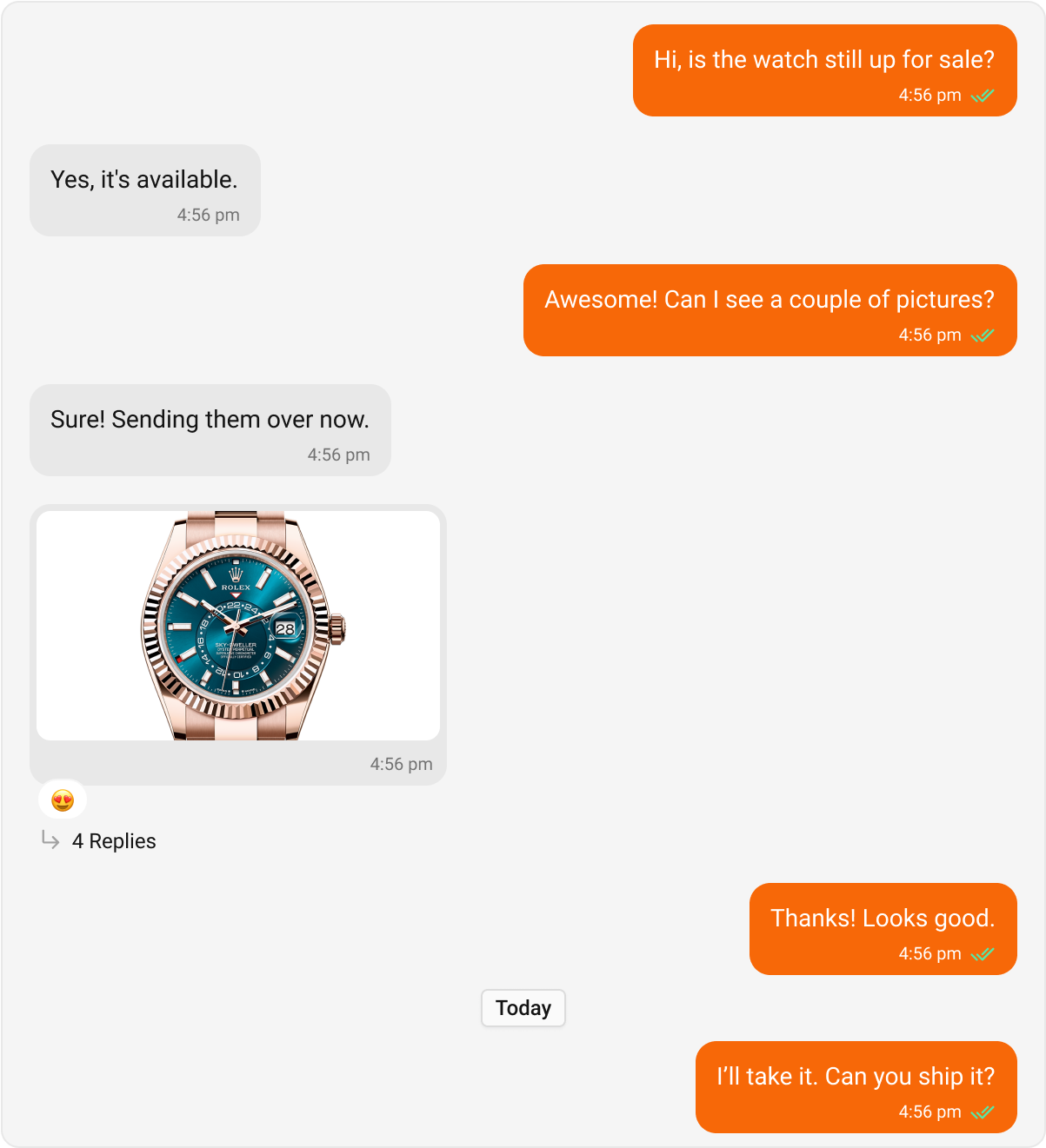
Message bubbles are the core visual element in chat applications, encapsulating different types of messages like text, images, or attachments. Customizing message bubbles allows developers to create a consistent and engaging user experience that aligns with their app’s theme and design language. This guide provides an overview of how to style outgoing and incoming message bubbles and customize the appearance for specific message types.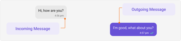
Types for Incoming and Outgoing Bubble Style
Incoming bubbles represent messages received from other users.DeepPartialis an internal utility that ensures all style properties are optional, allowing only the required fields to be overridden.- When customizing theme properties, whether by overriding specific properties or supplying a completely custom theme, the provided values will be deeply merged with the default theme. This means that only the specified properties will be overridden, while all other properties will retain their default values. Additionally, if a style is passed through props, it will take priority over the style provided via the theme.
#f90ac6, while all other incoming message bubbles will have #f90a4e. The paddingHorizontal value set in incomingMessageBubbleStyles.containerStyle will also apply to all incoming message bubbles, unless explicitly overridden for a specific bubble type. For instance, you can set incomingMessageBubbleStyles.textBubbleStyles.containerStyle.paddingHorizontal to 0 if you want to remove horizontal padding for text bubbles.
Message Bubbles
Message bubbles are core elements of the messaging interface. Their collective appearance can be customized to create a consistent design, including color, shape, and overall style for both outgoing and incoming messages. The message bubbles’ styles can be customized by extending the predefined styles in your theme. Customizing Incoming Message Bubble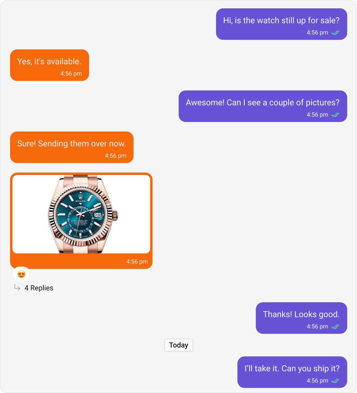
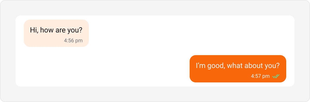
Text Bubble
Text bubbles display plain text messages. These are the most common bubble type in a chat interface. Default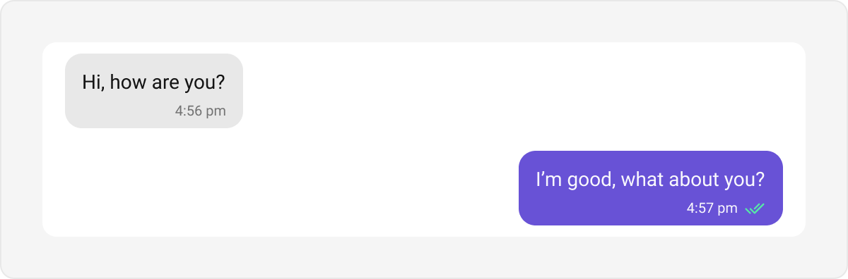
Link Preview Bubble
The Link Preview Bubble is designed to display a preview of links shared in messages. It enriches the messaging experience by showing details such as the page title, description, and an image from the linked content, making links more engaging and informative. Default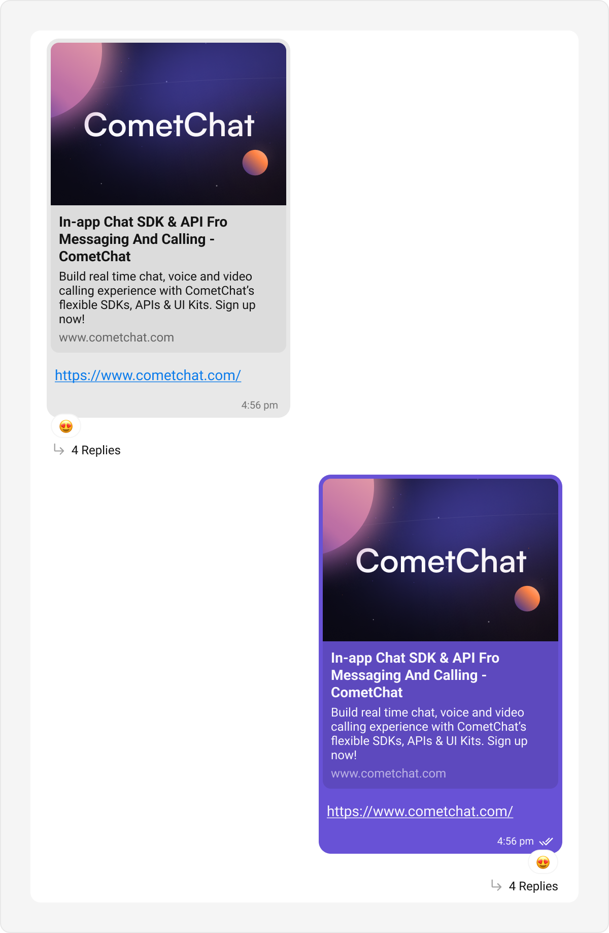
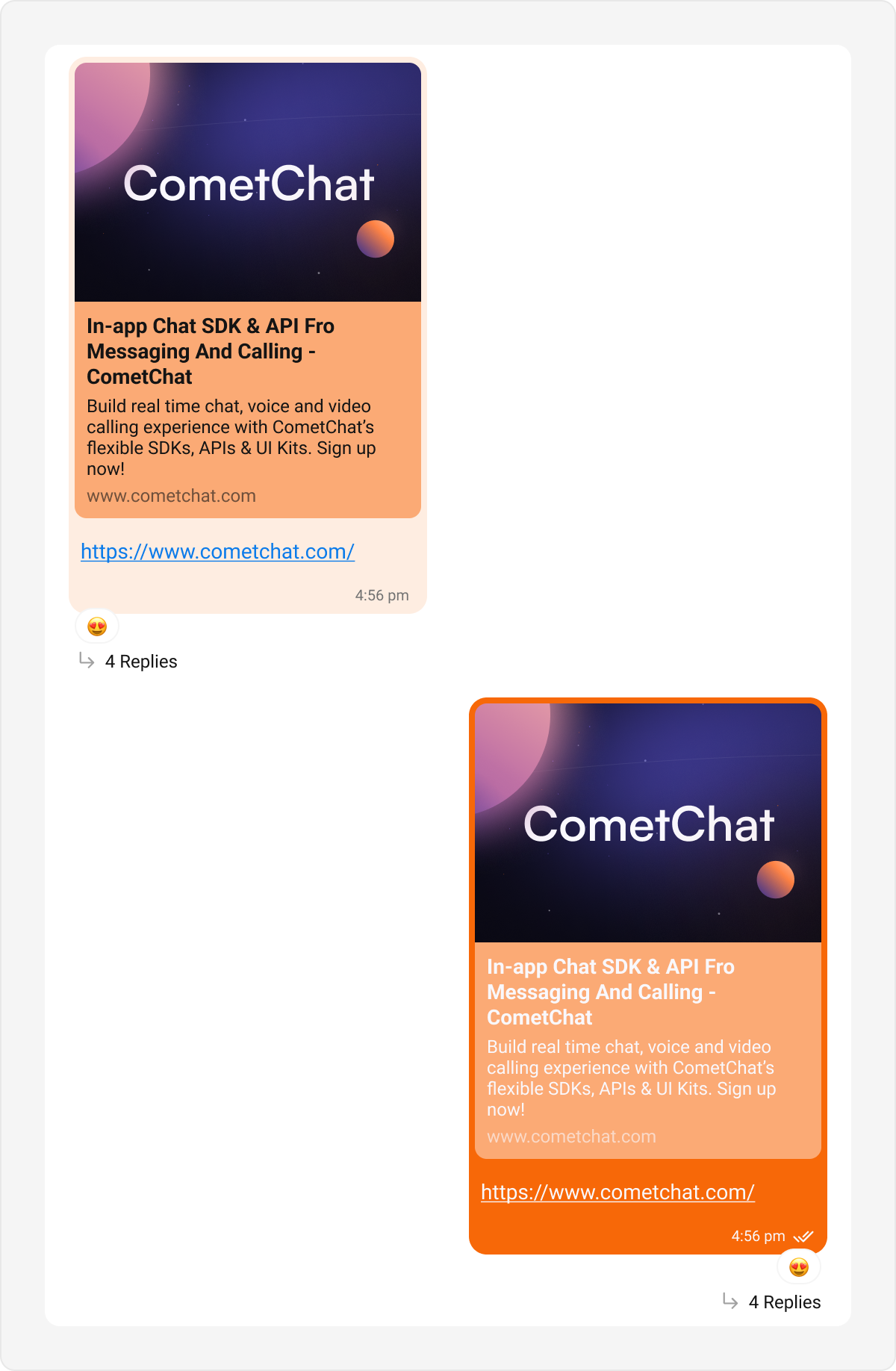
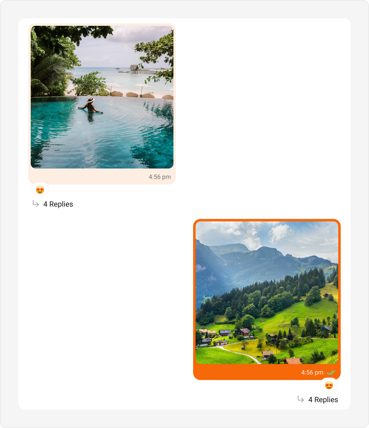
Image Bubble
Image bubbles display images shared within a conversation. Default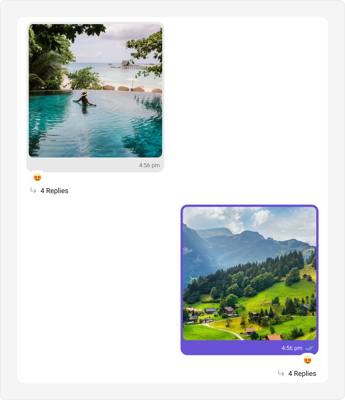
Video Bubble
Video bubbles display video messages or clips in a chat. Default Customization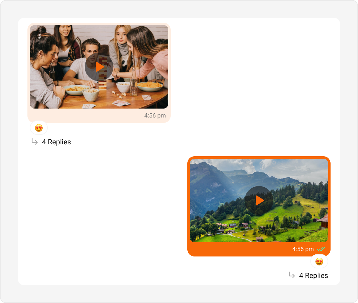
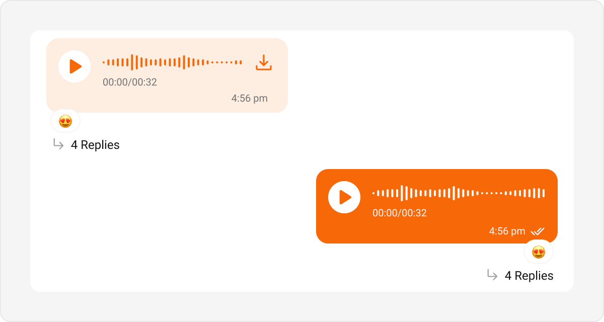
Audio Bubble
Audio bubbles represent audio messages or voice recordings. Default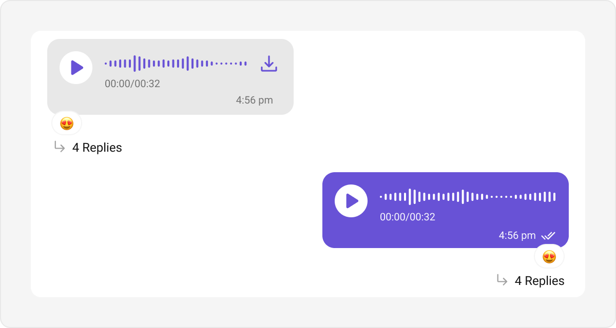
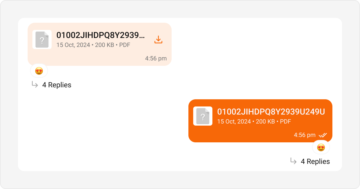
File Bubble
File bubbles are used to display shared files, such as documents, PDFs, or spreadsheets. Default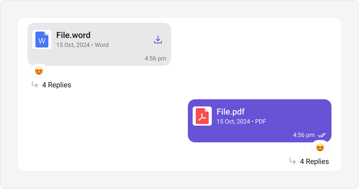
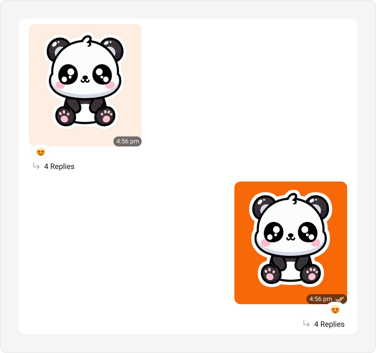
Sticker Bubble
Sticker bubbles display stickers shared in a conversation, enhancing visual expression. Default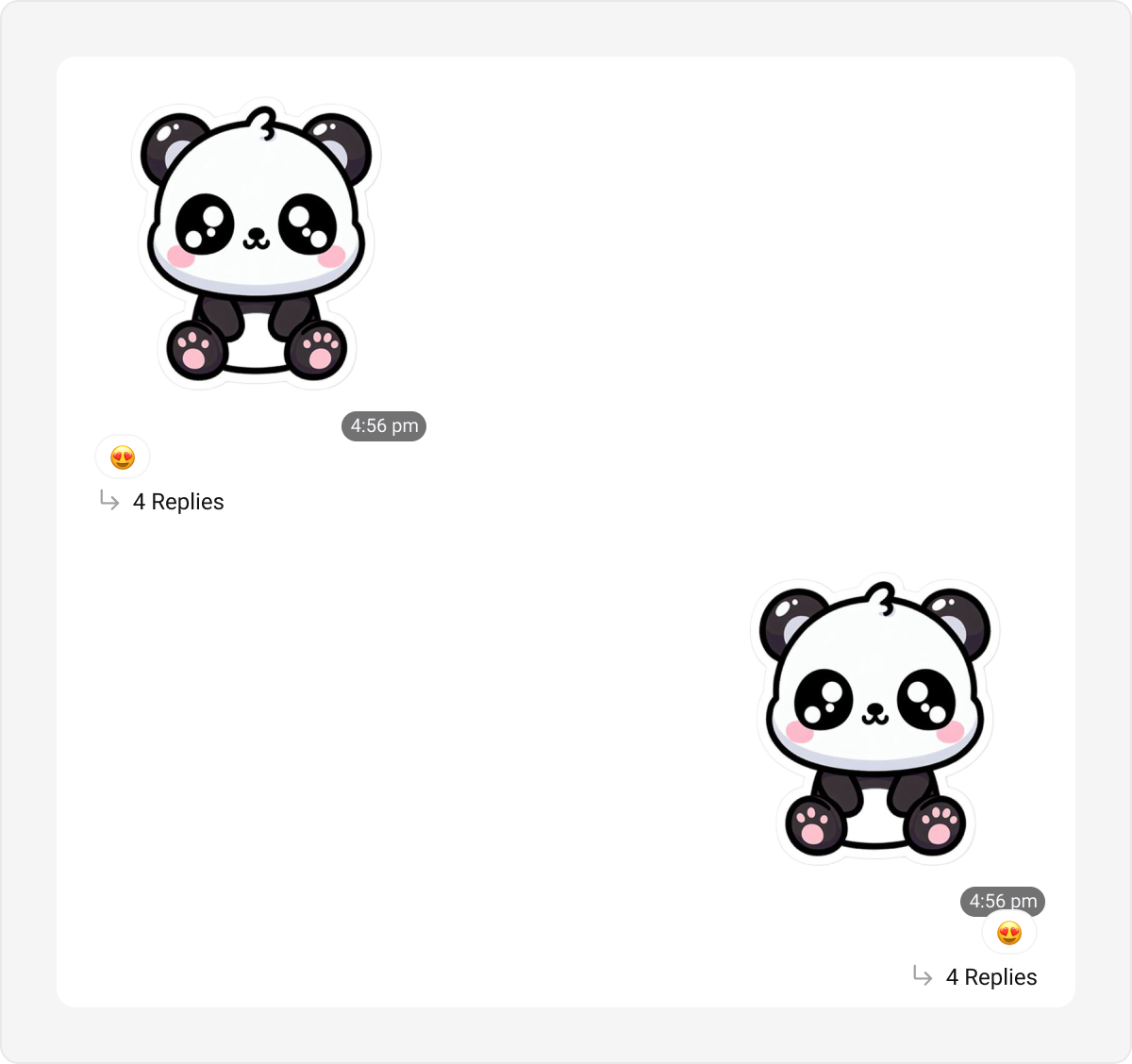
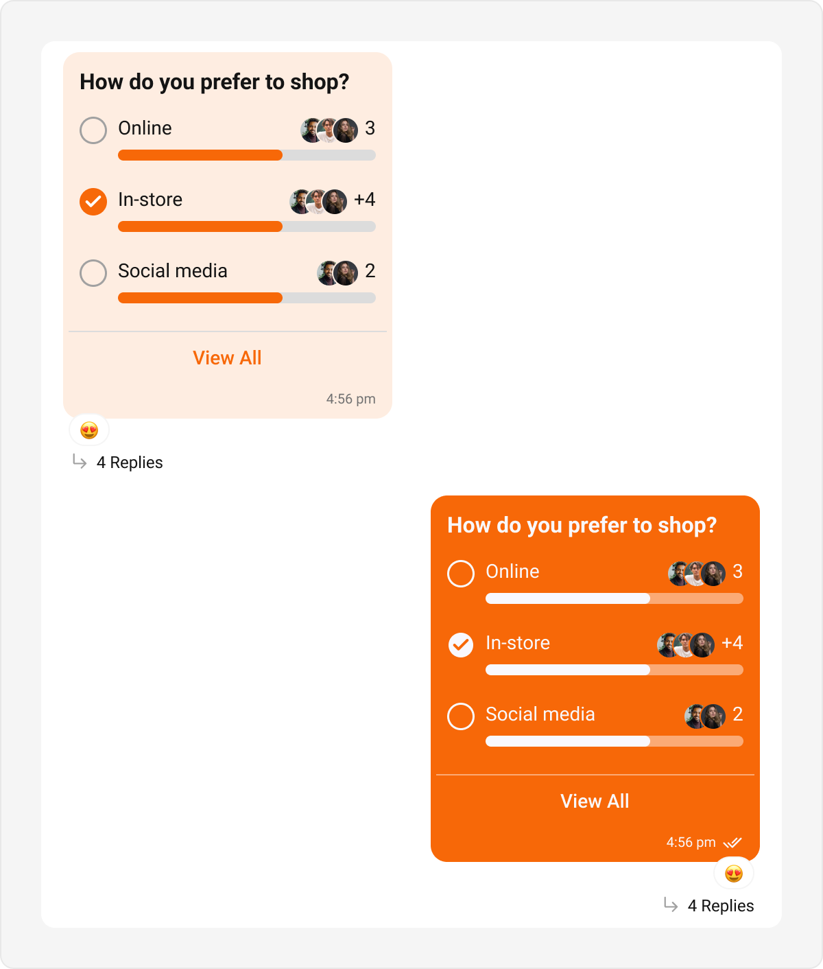
Poll Bubble
Poll bubbles represent polls shared within the chat, showing options and results. Default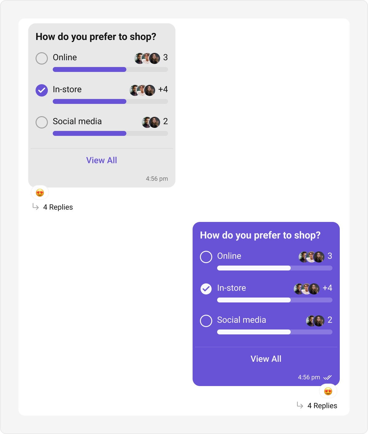
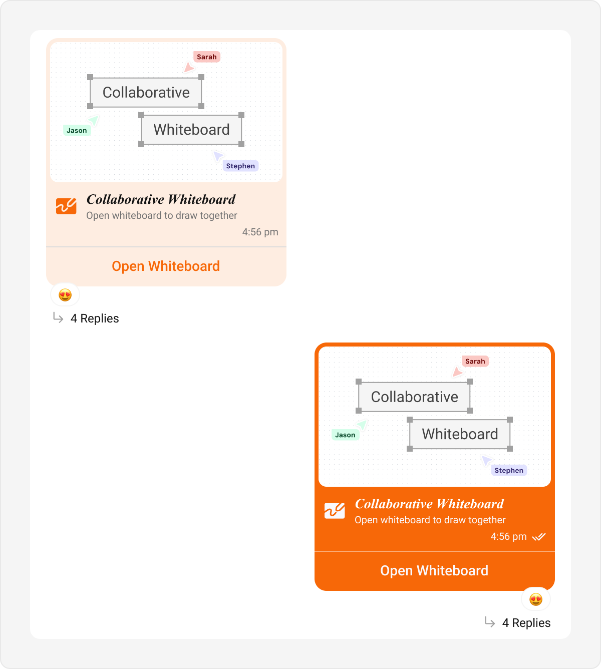
Collaborative Bubble
Collaborative bubbles display collaborative content, such as shared documents or tasks. Default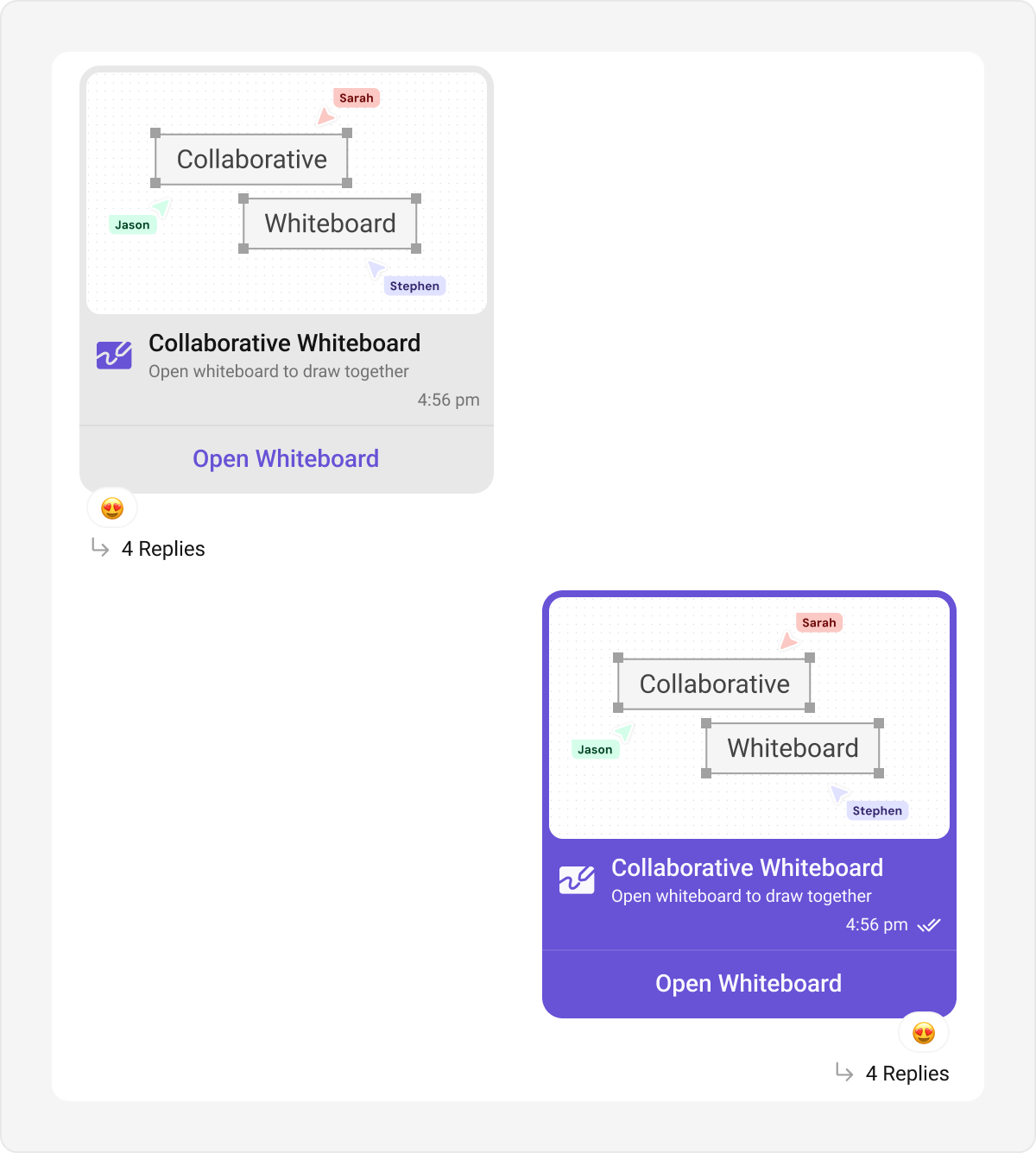
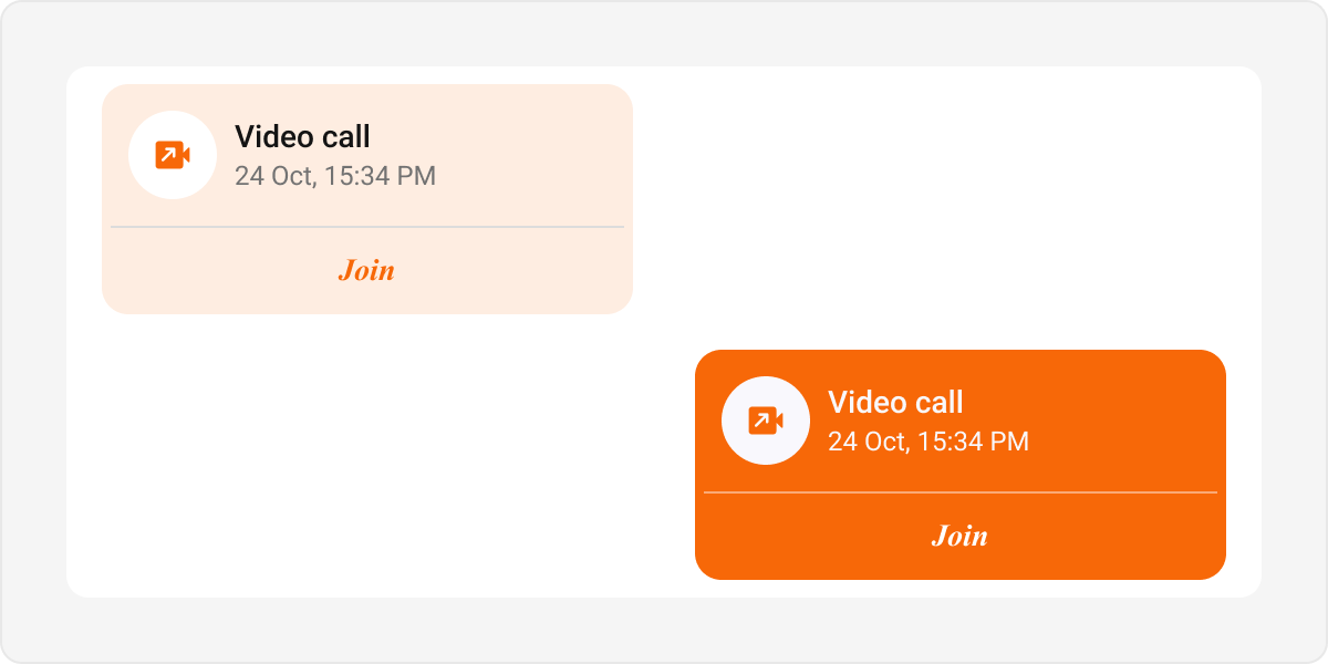
Meet Call Bubble
Meet call bubbles display call-related actions and statuses in the chat interface. Default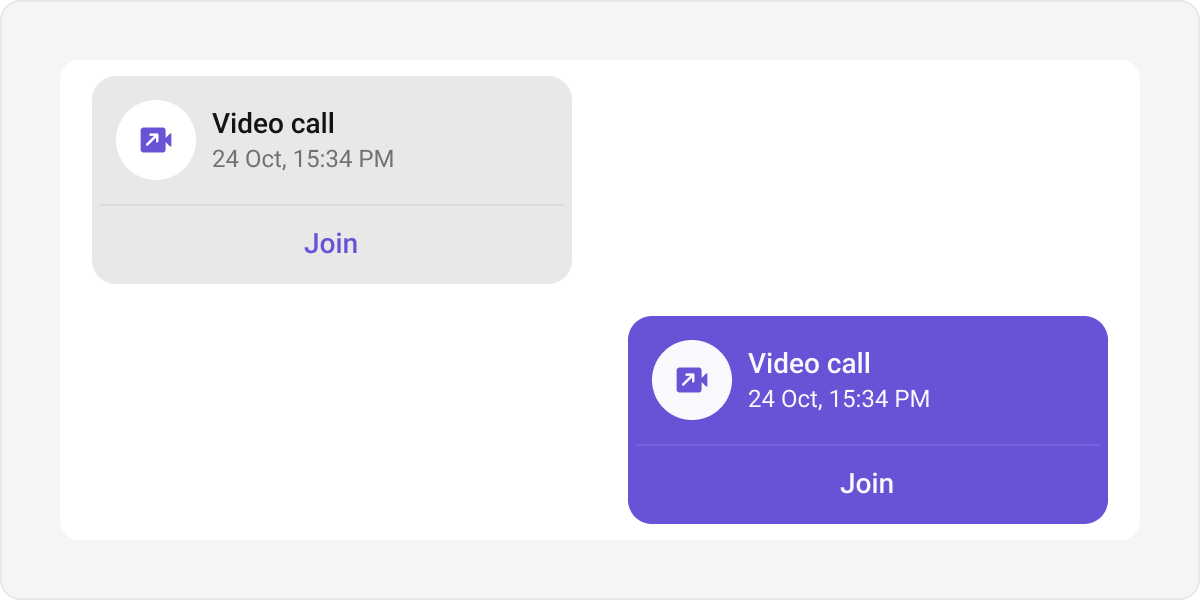
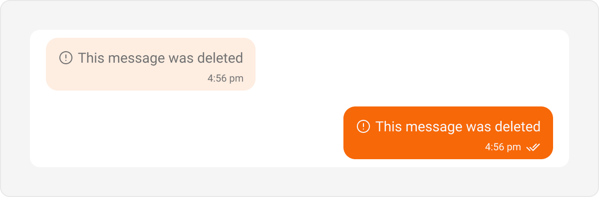
Delete Bubble
Delete bubbles are used to display messages that have been deleted by the sender. These indicate the message removal within the chat interface. Default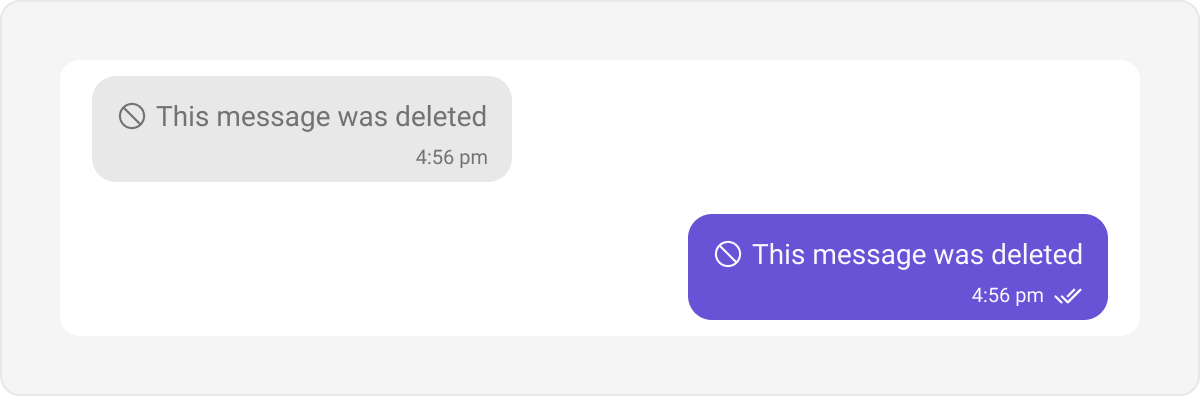
Call Action Bubble
Call action bubbles display call-related actions, such as missed calls, in the chat interface. Default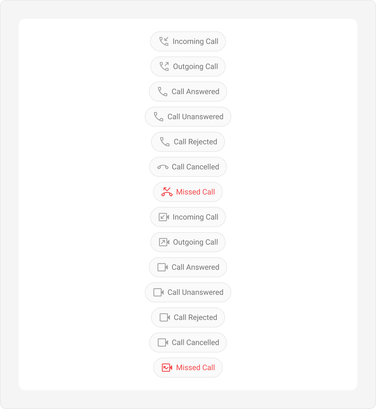
Action Bubble
Action bubbles provide a customizable interface for displaying a variety of actions, such as group actions, within a chat. Default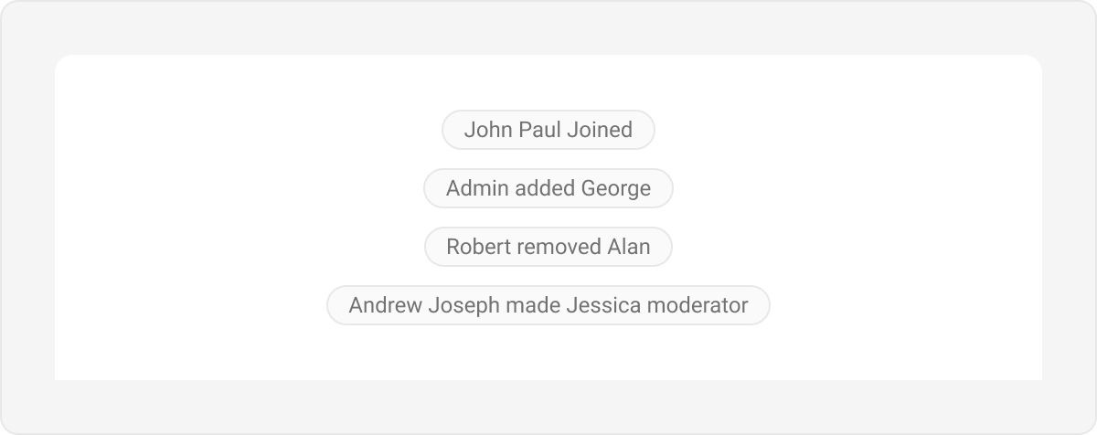
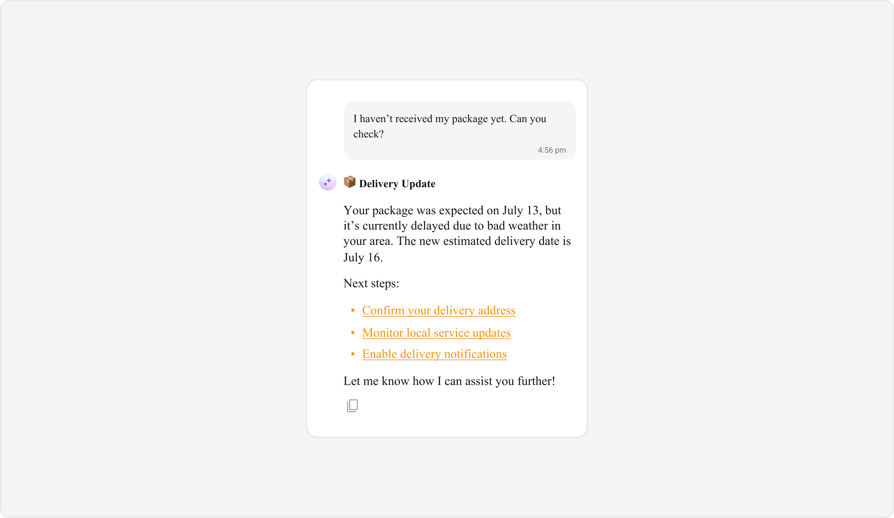
AI Assistant Bubble
AI Assistant bubbles display messages and interactions from an AI assistant within the chat interface. Default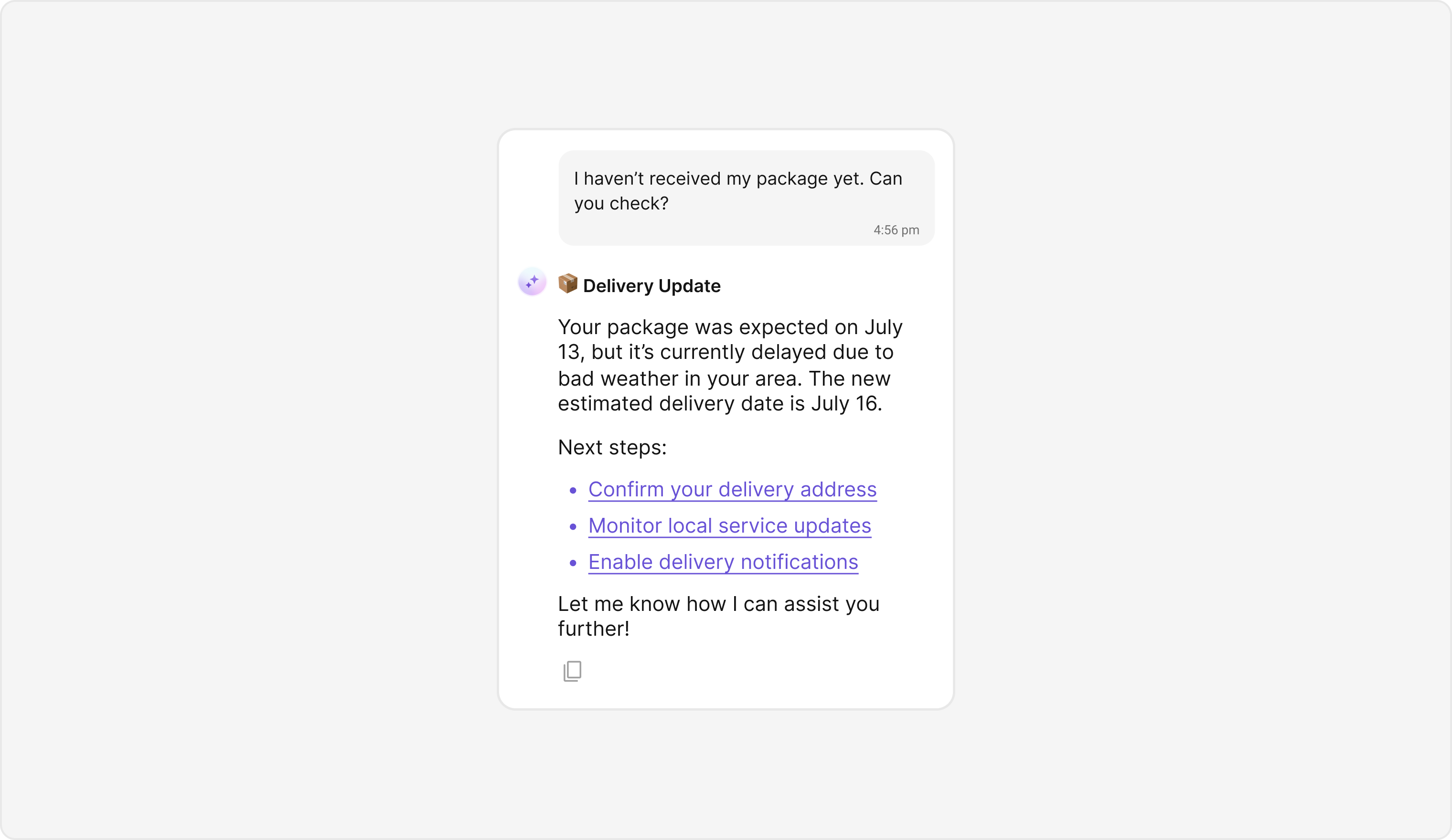
Next Steps
Introduction to Theming
Learn how CometChatThemeProvider manages light and dark modes
Colors
Customize primary, neutral, alert, and other color tokens
Component Styling
Style individual UI Kit components like Conversations and Users
Message List
Explore the Message List component and its customization options