AI Integration Quick Reference
AI Integration Quick Reference
Where It Fits
CometChatMessageHeader is a Component that showcases the User or Group details in the toolbar. It presents a typing indicator and a back navigation button for ease of use.

Minimal Render
Actions and Events
Callback Props
onError
Fires on internal errors (network failure, auth issue, SDK exception).onBack
Fires when the back button in the app bar is pressed. RequiresshowBackButton={true}.
onNewChatButtonClick
Fires when the new chat button is pressed (only applies to AI Assistant users). Allows handling starting a new conversation with the AI assistant.onChatHistoryButtonClick
Fires when the chat history button is pressed (only applies to AI Assistant users). Allows handling opening the AI assistant chat history.Custom View Slots
Each slot replaces a section of the default UI. Slots that accept parameters receive the user or group object for customization.| Slot | Signature | Replaces |
|---|---|---|
ItemView | ({ user, group }) => JSX.Element | Entire header layout |
LeadingView | ({ user, group }) => JSX.Element | Avatar / left section |
TitleView | ({ user, group }) => JSX.Element | Name / title text |
SubtitleView | ({ user, group }) => JSX.Element | Status / subtitle text |
TrailingView | ({ user, group }) => JSX.Element | Right section next to call buttons |
AuxiliaryButtonView | ({ user, group }) => JSX.Element | Replaces default call buttons |
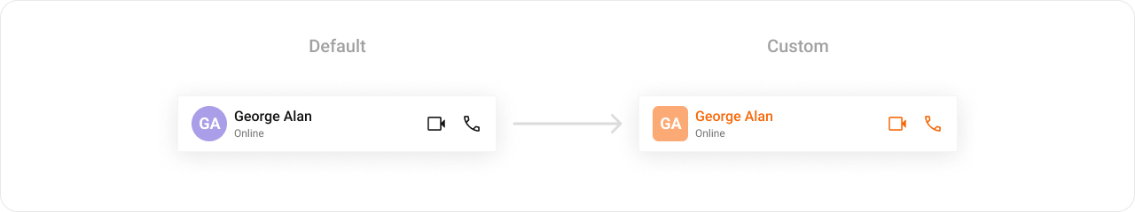
TitleView
Custom view for the name / title text.AuxiliaryButtonView
Custom buttons that replace the default call buttons.ItemView
Custom view for the entire header layout.SubtitleView
Custom view for the subtitle / status text.
LeadingView
Custom view for the avatar / left section.TrailingView
Custom view for the right section next to call buttons.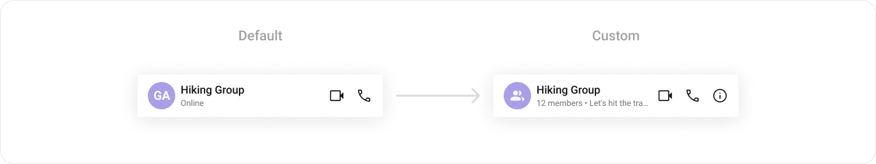
Styling
Using Style you can customize the look and feel of the component in your app. Pass a styling object as a prop to theCometChatMessageHeader component.
Visibility Props
| Property | Description | Code |
|---|---|---|
showBackButton | Toggle visibility of the back button in the app bar | showBackButton?: boolean |
hideVoiceCallButton | Toggle visibility of the voice call button | hideVoiceCallButton?: boolean |
hideVideoCallButton | Toggle visibility of the video call button | hideVideoCallButton?: boolean |
usersStatusVisibility | Toggle user status visibility | usersStatusVisibility?: boolean |
hideNewChatButton | Toggle visibility of new chat button for AI Assistants | hideNewChatButton?: boolean |
hideChatHistoryButton | Toggle visibility of chat history button for AI Assistants | hideChatHistoryButton?: boolean |
options
Custom menu items for the header options menu.Next Steps
Message List
Display the list of messages in a conversation
Message Composer
Compose and send messages in a chat
Messages
Complete messaging interface with header, list, and composer
Component Styling
Customize the appearance of UI Kit components