

AI Integration Quick Reference
AI Integration Quick Reference
Where It Fits
CometChatMessageComposer is a Component that enables users to write and send a variety of messages, including text, image, video, and custom messages. Features such as Live Reaction, Attachments, and Message Editing are also supported.
Wire it alongside CometChatMessageHeader and CometChatMessageList to build a standard chat view.

Minimal Render
Multi-Attachment Staging Tray
WhenenableMultipleAttachments is true (the default), picking files does not send them immediately. Files are staged in a tray below the input, uploaded in the background, and sent together when the user taps send:
- Pick — choose one or more files from the attachment (
+) menu. InCometChatCompactMessageComposer, images and files copied to the clipboard can also be pasted straight into the composer — they stage into the tray as tiles, just like a pick (subject to the same count and size limits). - Stage & upload — each file becomes a tile in the tray and starts uploading right away with its own progress. The user can keep typing or add more files while uploads run. The voice-recording button hides while attachments are staged.
- Review — remove any tile, or retry one whose upload failed. Tapping a rejected tile shows why it was rejected (as a toast).
- Send — the staged files fan out into media messages that share a single batch, and the message list renders them as one connected group of plural bubbles.
Tray tile states
Failed uploads are transient and can be retried; rejected files must be swapped out.
Attachment limits
- Count — a batch holds up to a server-configured maximum (default 10, from the
file.count.maxapp setting, resolved at runtime). The limit is all-or-nothing: if a pick would push the tray past the maximum, the entire new selection is rejected — nothing is staged — and a toast explains the limit. Already-staged files are untouched. - Per-file size — a file larger than the allowed size (
file.size.max) is rejected as an individual tile; tapping the tile shows the size limit.
Batch send
On send, staged files are grouped by media kind and sent as one media message per kind, in a fixed order — Images → Videos → Audios → Files — all sharing a singlebatchId. The caption goes on the last message of the batch. The message list groups messages with the same batchId and renders them as one visually connected set.
Disabling the tray
SetenableMultipleAttachments={false} to revert to legacy single-select, send-immediately behavior — each attachment option sends one file straight away, with no staging tray. Pass the same value to CometChatMessageList so rendering matches.
Actions and Events
Callback Props
onSendButtonPress
Fires when the send message button is clicked. Overrides the default send behavior.onError
Fires on internal errors (network failure, auth issue, SDK exception).onTextChange
Fires as the user types in the composer input.Global UI Events
CometChatUIEventHandler emits events subscribable from anywhere in the application. Add listeners and remove them on cleanup.
When to use: sync external UI with message state changes. For example, update a notification badge when messages are sent, or trigger analytics when a message is edited.
In React 18 StrictMode,
useEffect runs twice on mount in development. The component handles listener cleanup internally, but any additional listeners added alongside the component need cleanup in the useEffect return function to avoid duplicate event handling.Custom View Slots
Each slot replaces a section of the default UI. Slots that accept parameters receive the relevant data for customization.textFormatters
Custom text formatters for the composer input. To configure the existing Mentions look and feel check out CometChatMentionsFormatter.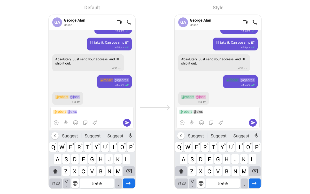
attachmentOptions
Override the default attachment options with custom actions.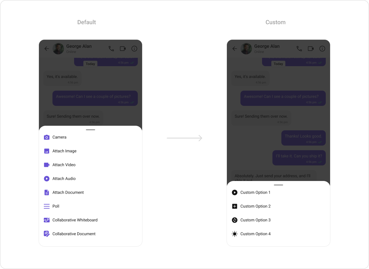
addAttachmentOptions
Extends the default attachment options with additional actions.AuxiliaryButtonView
Replace the sticker button area with a custom view.The MessageComposer Component utilizes the AuxiliaryButton to provide sticker functionality. Overriding the AuxiliaryButton will replace the sticker functionality.

SendButtonView
Replace the send button with a custom view.
HeaderView
Custom view above the composer input.
Styling
Using Style you can customize the look and feel of the component in your app. These parameters typically control elements such as the color, size, shape, and fonts used within the component.
Visibility Props
Next Steps
Message List
Display the list of messages in a conversation
Message Header
Display user or group details in the chat toolbar
Messages
Complete messaging interface with header, list, and composer
Component Styling
Customize the appearance of UI Kit components